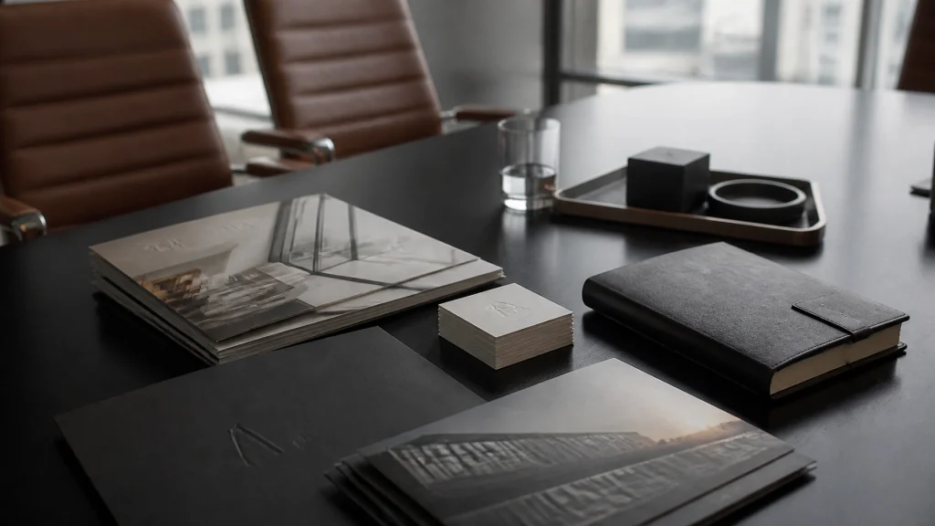
Picture this: You’ve just spent three weeks orchestrating the most ambitious marketing campaign of your career. The creative is fire. The copy is tight. The budget is… well, it was a battle, but you won. Then, the boxes arrive. You tear one open with the enthusiasm of a kid on Christmas morning, only to realize that your "vibrant sunset orange" brochures look more like "forgotten sweet potato casserole."
Ouch.
Your heart sinks. Your boss raises an eyebrow. And suddenly, those "savings" you found by going with the cheapest online printer feel like a very expensive mistake.
Print procurement, the fancy term for getting stuff printed without losing your mind, is an art form disguised as a logistics puzzle. It’s the bridge between a brilliant digital design and a physical object that your customers can actually hold. When it works, it’s magic. When it doesn't? It's a deluge of frustration sent to test your very fortitude.
At Proforma Awards Print & Promotions, we’ve seen it all. From the "oops, we forgot the bleed" disasters to the "I didn't realize 80lb text was that thin" catastrophes. We act as an extension of your team to ensure these nightmares stay in the "hypothetical" category.
Ready to stop the bleeding (and the bad bleeds)? Let’s dive into the seven most common mistakes you're making with your print procurement and, more importantly, how to fix them before they cost you a dime.
1. The "I’ll Know It When I See It" Spec Sheet
Vague specifications are the silent killer of great print projects. If your request to a printer sounds like, "I need some nice-looking booklets, maybe about 20 pages, on good paper," you are playing a dangerous game of Russian Roulette with your brand.
(Actually, it’s worse. At least in Russian Roulette, you know the odds.)
When you leave the details up to "interpretation," you’re letting someone else decide the weight, the finish, the coating, and the binding of your brand's physical identity. One person’s "good paper" is another person’s "cheap flyer stock."

The Fix: Speak the Language of Specs
You don’t need to be a master lithographer, but you do need to be specific. Every printing project should have a detailed brief. We’re talking:
- Finished Size: Not just "it's big," but "8.5 x 11 inches."
- Paper Weight: Is it 100lb Cover? 80lb Text? (Pro tip: "Cover" is thick like a postcard; "Text" is thin like a magazine page).
- Coating: Gloss, Matte, Dull, or Soft Touch? (Soft touch feels like a peach, by the way. It’s glorious).
- Binding: Saddle-stitched (staples), Perfect Bound (glued spine), or Wire-O?
Proforma Wisdom: If this sounds like Greek to you, don’t panic. That’s why we’re here. We help you navigate the substrate jungle so your finished product doesn't just look good, it feels right.
2. The "Million-Dollar Typo" (A.K.A. The Proofing Panic)
We’ve all been there. You’ve read the copy forty-seven times. Your intern read it. Your cat probably sat on it. You’re certain it’s perfect. Then, the 10,000 units arrive, and you realize you spelled the CEO’s name wrong on page one.
Simple. Genius. Impact. (And by impact, I mean the sound of your career hitting a brick wall).
Relying on your screen to catch errors is mistake number two. Digital proofs are great for layout, but they are notorious for hiding typos that scream at you once they’re in physical ink. Even worse is the "autopilot proof," where you click "Approve" because you're in a rush to meet a deadline.

The Fix: The Physical Proof Protocol
Banish the "it looks fine on my iPhone" mentality.
- Request a Hard Proof: For anything high-stakes, get a physical sample. It allows you to check color accuracy and see how the ink interacts with the paper.
- The "Fresh Eyes" Rule: Never let the person who wrote the copy be the final proofreader. Their brain will automatically "fix" errors because it knows what it meant to say.
- Read It Backward: Seriously. Start from the last word and go to the first. It breaks the flow and forces you to see each word as an individual unit.
3. The "Wait, We Needed It Yesterday?" Syndrome
In the world of print, "ASAP" is not a strategy. It’s a cry for help.
The biggest mistake marketing managers make is treating print procurement as the final, 5-minute task in a campaign. They spend months on the strategy and days on the design, then expect the printer to produce, kit, and ship 500 custom boxes across the country by Tuesday.
Rushing leads to three things: higher costs (expedited shipping is a beast), lower quality (no time for proper drying or QA), and an early retirement for your print rep.
The Fix: Backward Scheduling
Stop looking at your start date and start looking at your "In-Market" date.
- Build a Buffer: If you need it on the 15th, your "must-have" date is the 10th.
- Account for "The Extras": Printing is fast; finishing (folding, die-cutting, kitting & fulfillment) takes time.
- Commit to Content Freeze Dates: No more "just one little change" while the plates are being made.
The Real Kicker: When you plan ahead, you can leverage bulk shipping and standard turn times, which keeps more of those Benjamins in your budget.
4. The "Color Blind" Brand Disaster (RGB vs. CMYK)
This is the technical hurdle that trips up even the most seasoned pros. Your screen shows you colors using light (RGB). A printing press creates colors using ink (CMYK).
If you send an RGB file to a printer, the press has to "guess" how to translate those glowing pixels into flat ink. The result? That neon blue you loved becomes a muddy teal. That vibrant red? It now looks like a bruised plum.
(Who needs one more thing hugging them around tax season? Not your brand colors, that's for sure.)
The Fix: Standardize Your Sandbox
- Design in CMYK from Day One: Don't convert at the end; start there.
- Use Pantone (PMS) for Logos: If you have a specific brand color (think Coca-Cola red or Starbucks green), use a Pantone spot color. It’s like a "paint code" for your brand that ensures consistency whether you’re printing in New York or Nebraska.
- Check Your Resolution: 72 dpi is for the web. 300 dpi is for print. Anything less, and your beautiful imagery will look like a Lego set.
5. The "Cheap Paper" Trap
You’re looking at two quotes. Quote A is $500. Quote B is $1,200. You choose Quote A because, hey, paper is paper, right?
Wrong.
Choosing the wrong substrate is like wearing flip-flops to a black-tie gala. It’s technically footwear, but everyone knows you missed the memo. If you’re printing an annual report for a high-end financial firm on flimsy, 20lb bond paper, you’re telling your clients that you don’t value the details.
The Fix: Tie Material to Use-Case
Ask yourself: Where will this live?
- Direct Mail: Needs to be sturdy enough to survive the USPS sorting machines without looking like it went through a blender.
- Outdoor Signage: Needs UV protection so it doesn't fade into a ghost of its former self within a week.
- Corporate Apparel: It’s not just about the logo; it’s about the fabric. A Nike or Adidas polo says something very different than a generic "Value Tee."
Ditch the Boring: Sometimes, the right "paper" isn't paper at all. It might be a synthetic material, a soft-touch laminate, or a textured linen. We love helping our clients find that "wow" factor that makes a recipient stop and say, "Wait, let me look at this."
6. The "Ship It and Forget It" Logistics Nightmare
Printing the pieces is only half the battle. The real magic happens in the Kitting & Fulfillment phase.
Mistake number six is thinking that your job ends when the pallet leaves the printer. If those beautiful printed pieces are going to 100 different branch locations, and you haven't accounted for custom packaging, tracking, or "last-mile" delivery, you’re in for a world of hurt.

The Fix: The Total Solution Approach
Don't just buy "stuff"; buy a system.
- Online Company Stores: If you have employees or branches ordering regularly, an Online Company Store is a literal life-saver. It automates the ordering, tracks the inventory, and ensures brand consistency across the board.
- Custom Packaging: The box is the experience. A printed piece inside a generic brown box is a missed opportunity. A printed piece inside a custom-branded "swag box" with matching crinkle paper? That’s an event.
- Centralized Distribution: Stop playing "Warehouse Manager" from your office desk. Let us handle the storage and shipping so you can get back to, you know, marketing.
7. The "Single-Source" Stagnation
Many companies fall into the trap of using one local printer for everything because "that's how we've always done it." While loyalty is great, no single print shop is an expert at everything.
One shop might be amazing at high-volume brochures but terrible at wide-format banners. Another might excel at business cards but struggle with corporate apparel. If you try to force all your needs through one narrow pipe, you’ll eventually see a dip in quality or a hike in price.

The Fix: Leverage a Global Network (Like Ours)
This is where Proforma really shines. We aren't just a printer; we are your gateway to a massive network of specialized production facilities.
- Expertise Matching: We match your specific project to the facility best equipped to handle it.
- Buying Power: Because we move so much volume, we get pricing that a single business simply can't touch.
- Consistency: You get one point of contact (us!), but the benefit of a thousand specialists.
Breaking Through the Noise
At the end of the day, print procurement shouldn't feel like a dental appointment. It should be the most rewarding part of your job: the moment your vision becomes reality.
By avoiding these seven pitfalls, you’re not just saving money; you’re protecting your brand’s reputation. You’re ensuring that when that box arrives, you’re not met with a "sweet potato casserole" orange, but with the exact, vibrant, "wow-factor" results you expected.
Stop the guesswork. Start the growth.
Whether you're looking to revamp your recognition programs, launch a new line of custom gear, or finally get your logistics under control, we’re ready to act as an extension of your team.

Ready to elevate your brand? Contact us today and let’s turn your next "to-do" list into a "done-and-dazzled" masterpiece.
Simple. Genius. Impact.
That’s the Proforma way.